SVMIC Logo
The SVMIC logo reflects our role in the evolving medical liability field. It must always be used exactly as shown in these guidelines, including approved colors, variations, and the ® symbol, which must appear immediately to the right of the logotype.
The horizontal logo is the primary and preferred representation of the SVMIC brand and should be used whenever space allows.





The stacked logo is an alternate configuration intended for use in vertical or space-constrained layouts where the horizontal logo is not practical.




The SVMIC symbol, referred to as the Mobius Square, may be used independently in contexts where the full logo is not required.





Logo Clear Space & Minimum
To maintain legibility and visual impact, the logo must always be surrounded by adequate clear space and never reproduced below the minimum size outlined here.
Clear Space
Clear Space
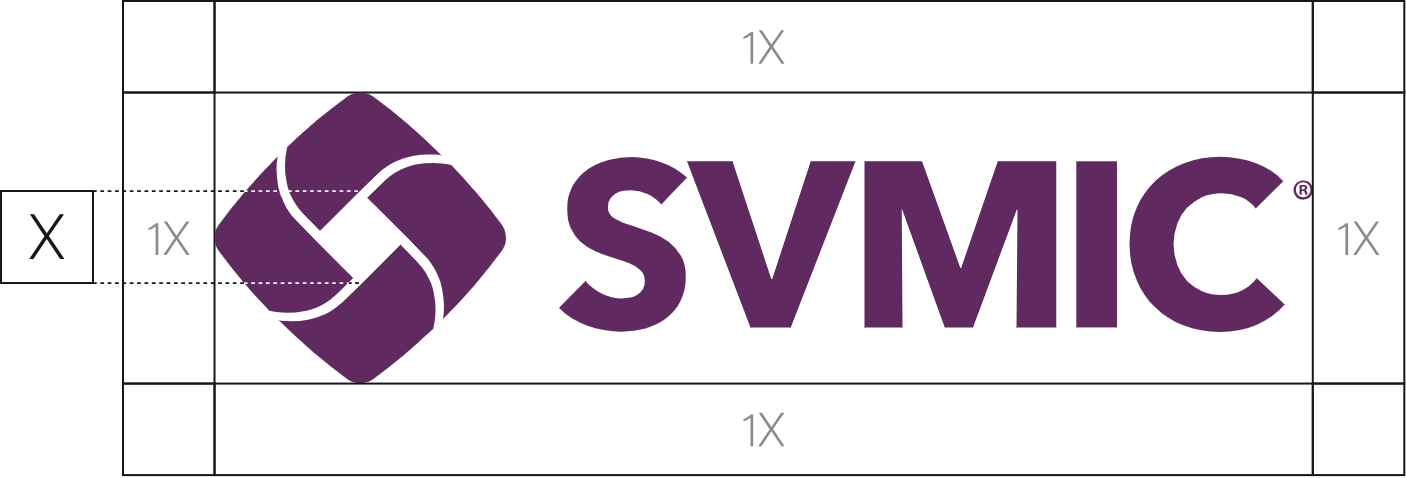
Minimum Size
Minimum Size

.75" wide — print
100 pixels — digital
Clear Space
Clear Space
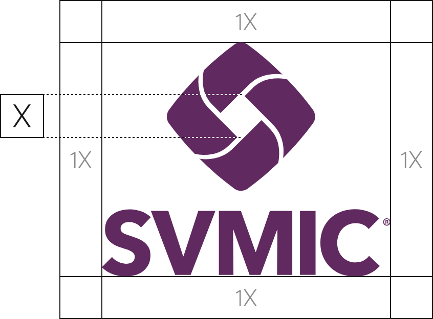
Minimum Size
Minimum Size
.5" wide — print
50 pixels — digital
Clear Space
Clear Space

Minimum Size
Minimum Size

.5" wide — print
40 pixels — digital
Extended Logo Variations
These extended logo variations are intended for specific use cases where the primary logo is not appropriate or legibility requires an alternate treatment.








Additional Logos
SVMIC maintains several subsidiary brands and programs, each with its own approved logo. These logos should be used as provided and not modified, recolored, or rebuilt.
Each download includes full-color, one-color, and grayscale versions for print and digital use.






Tagline
The tagline is not part of the official logo and should not be incorporated into it. The logo and tagline may be used together when appropriate but should remain separate brand elements.


































Logo Best Practices
These examples illustrate correct and incorrect logo usage. Avoid any usage that alters the logo’s proportions, color, or clarity.
Correct Usage
When using a white or light gray background, use the primary blue or purple logo.
Brand colors can be used behind the logo as long as there is sufficient contrast.
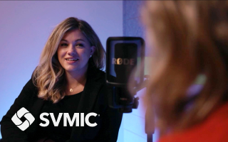
When using against a photographic background, ensure the logo has sufficient contrast to the background.
Incorrect Usage
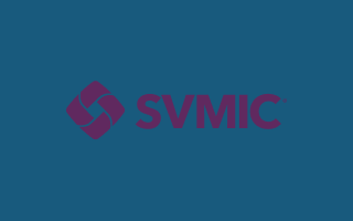
Never use primary brand colors as both foreground and background.
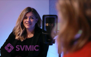
When using against a photographic background, ensure the logo has sufficient contrast to the background.
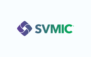
Don't use a gradient to color the logo.
Never display the logo using a color outside of the brand palette.
Never alter the proportions of the logo.
Do not use without the brand symbol.
Don't use drop shadows.
Don't outline the logo.
Don't recreate the logo with a font.
Do not add text or taglines.
Color Palette and Usage Priority
The SVMIC color palette is anchored by blue and purple as the primary brand colors. These should be used most often and form the foundation of all visual communication. Supporting neutrals and accent colors provide flexibility while maintaining clarity, hierarchy, and restraint.
Color swatch size reflects recommended usage frequency, helping guide balance and hierarchy across layouts.
Primary Palette
Blue and purple are the primary brand colors and should be used most frequently. Blue is the preferred default for layouts, backgrounds, and large areas of color, while purple is typically used to reinforce brand presence through headings, accents, and key moments.
Supporting Palette
The supporting palette provides structure, contrast, and emphasis. Dark gray and white should be used regularly to support readability and balance. Red and light gray are intended for limited, intentional use, such as calls to action or subtle emphasis, and should not dominate a layout.
Extended Palette
The extended palette includes tonal variations of the core brand colors. These colors support accessibility, contrast requirements, and specific UI needs without introducing new brand colors. Use only when primary or supporting colors do not meet functional requirements.
Typography System
SVMIC uses a limited type system to maintain clarity, consistency, and flexibility across communications.
Meta Serif is the primary brand typeface and should be used primarily for headlines and subheads. It brings clarity, authority, and distinction to SVMIC communications.
Meta Serif
abcdefghijklmnopqrstuvwxyz
1234567890
Styles and Weights
Alternate Typeface
Acumin is the secondary brand typeface and should be used for body copy and longer text. It is designed for readability and works across both print and digital applications.
Acumin Pro
abcdefghijklmnopqrstuvwxyz
1234567890
Styles and Weights
Alternate Typeface
Typography in Use
For Headings
Typeface: Meta Serif Book
Format: Sentence Case
For Headings
Typeface: Meta Serif Book
Format: Sentence Case
For Body Copy
Typeface: Acumin Pro Light
Format: Sentence Case
For Body Copy
Typeface: Acumin Pro Light
Format: Sentence Case
Etiam a felis suscipit, accumsan purus sit amet, faucibus erat. Phasellus non nunc eleifend, tristique massa et, cursus ligula. In accumsan ligula rutrum ex egestas molestie.
Iconography
The SVMIC Value Icons should always be displayed alongside their associated titles and supporting sentences. Icons are approved for print and digital use, with animated versions available for digital applications to add emphasis without distraction.
Icons are available in several approved brand colors. Never recolor icons with non-brand colors or alter their proportions or line weights.
Need a specific color?
Choose from pre-made sets in approved brand colors from our Asset Library.

Integrity
Do the right thing, always.

Diversity
Intentionally commit to the equitable respect, inclusion, and empowerment of all individuals.

Responsiveness
Act promptly and decisively, anchored by deep knowledge and careful listening.

Collaboration
Work enthusiastically with others and be open to different perspectives.

Service
Commit to helping our policyholders, team members, and community.

Innovation
Continually seek better solutions while anticipating future needs.

Stewardship
Take good care of the resources entrusted to us.
Photography
All photography used in SVMIC communications must be properly licensed. Images found through a general internet search are almost always protected by copyright, and using them without a license exposes SVMIC to legal and financial liability.
What to Look For
People first
People first
Images should feature a variety of real-looking professionals (physicians, nurses, practice managers, office staff) in authentic moments rather than overly staged poses.
Real life settings
Real life settings
Both clinical and office environments are appropriate. Avoid images that feel too sterile or too casual.
Warm and approachable
Warm and approachable
Light, tone, and composition should feel human. Avoid dramatic lighting, heavy filters, or stock photo cliches.
Diverse representation
Diverse representation
Photography should reflect the breadth of professionals SVMIC serves across roles, backgrounds, and experience levels.
Clean and uncluttered
Clean and uncluttered
Avoid busy backgrounds or images where the subject competes with the environment.
Photography Examples
The images below represent photography styles that align with the SVMIC brand. They are not an exhaustive library of approved images.
Stock Photography
Visit our Asset Library to select from available images.
Can't find what you need?
Browse Adobe Stock to find the right image then submit a request to purchase.


